Restaurant Construction Projects
Restaurant redesigns are a product of the times. Fast-food brands are reacting to changing demographics and increased competition. We examine how they are changing and what to expect!
Restaurants are changing their game to stay modern and current with restaurant trends. Taco Bell is ditching drive-thrus to build 300 to 350 concept restaurants that will serve alcohol, in new locations entitled Taco Bell Cantina. Yes, the restaurant is a part of the Taco Bell fast-food chain, which has more than 6,000 outposts in the U.S. serving a variety of Mexican and Mexican-ish foods. Taco Bell Cantina, unlike most of the other stores, is a ‘concept’ restaurant, one of about a dozen being rolled out across the country to test out a new permutation of the Taco Bell format. Taco Bell Cantina’s main distinguishing feature? It serves beer.
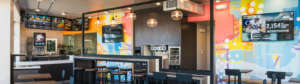
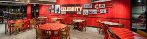
The locations feature trendy decor, DJs blasting music, and tapas-style appetizers. All serve at least one local beer. The regular Taco Bell menu is also available. One particular restaurant is located on a tight footprint on a corner about a block from the beach. There’s no drive-thru or parking lot, and on a Saturday night, the dining area was nearly full of mostly teenagers and 20-somethings. There was a line for the bathroom. On draft, the restaurant serves an amber lager from a local brewery rebranded as ‘Beach Bell’.
Taco Bell Cantina verges on the sleek, with dark wood-topped tables and black metal chairs, tall stools along a central dining bar, and hanging Edison bulbs. Murals by a local artist adorn the walls, and giant folding windows open up its edges to the outside. Next to the counter, a wall of glass separates and frames the food prep area like some cutting-edge test kitchen.
The beer, it turns out, is only part of what Taco Bell Cantina is experimenting with. The new concept is also testing the theory that what the restaurant looks like is as important as what food and drinks it serves.
Many other fast-food chains and quick-service restaurants are doing the same. Restaurants from McDonald’s to KFC to Starbucks are rethinking their spaces inside and out, in a wave of design interventions that, given the sheer number of these restaurants, will spread throughout the United States. These designs are setting a new standard for the commercial landscape, guiding the look and feel of the stores and restaurants on our streets and in our daily routines.
These redesigns are a product of the times. Fast-food brands are reacting to changing demographics, but they are also trying to stay competitive with the growing numbers of fast-casual restaurants, like Panera Bread and Chipotle, that are luring customers away from deep fryers and greasy burgers with healthier dining options. They are also trying to make the argument that going out for dinner and drinks with friends can happen at a Taco Bell.
It has become an industry standard to regularly rethink the branding and design of fast-food restaurants. Consultants suggest that stores undergo a refresh every three to five years. This may include new paint, light fixtures, menu boards, floor treatments, and other items. Every 10 years, they recommend a full-on redesign: tearing out seats, updating exterior architectural elements, maybe even scrapping the whole structure and building up from the foundation.
Sometimes the update is specific to the location and business trends of a particular restaurant. Other times it is a set of new design standards dictated from the corporate level to the franchisees who actually own and operate many of the restaurants. Regardless, the goal of these refreshes and redesigns is what is known in the industry as a ‘sales lift’ or a temporary but quantifiable increase in business. A well-executed refresh is expected to bring a 2 to 5 percent sales lift. A full redesign could yield a 10 to 15 percent lift.
Other new elements include places where people can plug in or wirelessly charge their phones and access free Wi-Fi for browsing. Creating that sense of difference can be challenging for restaurant owners, especially when certain design tropes become common. Fast-food restaurants have long fought to stand out from each other, but now they are battling relatively new competitors known as fast-casual restaurants. These slower-than-fast-food dining establishments have steadily moved in on fast food’s market by positioning themselves as healthier, slightly more authentic alternatives to the ubiquitous fast-food chains.
A quirk of designing for chains with thousands of restaurants and global marketing campaigns means that the design of the physical spaces often has to align with the image of the restaurant being portrayed in advertisements. In recent years, the KFC brand has built its advertising campaigns around an updated interpretation of the chain’s white-haired founder and human mascot, the long-deceased Colonel Sanders, playing on his Southern charm, while also making him a little feisty. The new campaign came with redesigns as well. The resulting design guidelines called for a range of possible changes. Full-scale redesigns include chicken-bucket-shaped light fixtures, barn-red furnishings, and photo-ready statues of the Colonel, which the corporation makes available to franchisees.
In 1962, long before the advent of the combination KFC-Taco Bell, you had Taco Bell standing on its own. Its first location was in the LA suburb of Downey, and the restaurant was designed to make an impact. With a Spanish tiled roof, arched veranda, and faux adobe walls, the Taco Bell of yesteryear had a distinct architecture, and this look became the model for the chain’s restaurants as it grew and spread. The theatrical Mexican theme of this building type also served to mark Taco Bell’s place on the urban and suburban landscape.
One night in November 2015, the original Taco Bell restaurant was plucked from the foundation where it had stood for the previous 53 years and loaded onto the back of a flatbed truck. Video footage from that night shows the restaurant, not much bigger than a two-car garage, perched doublewide on the back of the truck, a specimen of a building that could, at one time, be seen in hundreds, if not thousands, of towns across the country. After being strapped in place, the building was driven 45 miles to Taco Bell’s corporate headquarters in Irvine, where it remains today, a relic of a time when the building was the brand.
Today, in the era of the Taco Bell Cantina, the chain has diversified its approach to design, shifting far away from this signature building style. But branding through architecture is still a strategy used by some fast-food chains. Take the white castle-shaped buildings of the White Castle brand, for instance, or the sloping, hat-shaped red roof of the Pizza Hut chain. In its early years, McDonald’s required that its franchised restaurants use the famed golden arches, two parabola-shaped yellow bands on each end of the building that became a form of physical advertising. Now, for reasons such as cost and flexibility, brands are putting less emphasis on highly defined ornamental architecture and paying more attention to the experience of the customer, both in the drive-thru and inside the building.
On a commercial corner in Los Angeles, tucked between a gas station and a thrift store parking lot, sits an example of the modern McDonald’s. Apart from the iconic signage, the golden arches are gone. The restaurant is a long, rectangular stucco building, tan all over except for a few white protrusions. A few bands of yellow overhang the pedestrian walkways and a metal panel wraps around the top of the double-height windows that enclose the indoor play structure. On its long side, a driveway leads to two separate lanes where drivers place their orders. The double drive-thru, a relatively new concept being deployed at busier locations in the quick-service industry, is an attempt to make fast food even faster.
The most unusual thing about the dining area is the set of three tall double-sided video kiosks near the counter holding touch-screen displays where people can order and pay for their meals. Common in Europe, they’ve only been in use at McDonald’s restaurants for about a year and a half. An employee is standing nearby to help people through the process and is called upon often over the course of a half hour to assist confused customers. She taps the screen for a man, only for the machine to malfunction just before he can pull out his credit card. They move to another screen, hit another glitch, and eventually give up. The woman walks behind the counter and takes his order the old-fashioned way, in a fraction of the time.
This technology may be stumbling in its early days, but it’s becoming a feature of the design of fast-food restaurants. In the past, designers would try to optimize the restaurant’s operations by reconfiguring the kitchen and the counter. Now, they’re working the floor, creating spaces for people to do their own ordering, adding pick-up areas for on-demand food delivery apps, facilitating table service and the ability to deliver preordered food to customers waiting in the parking lot.
These are becoming part of the standard set of design elements being rolled out across McDonald’s restaurants around the world. In the past, each region had its own design group, but the work has been unified over the past year. This is also related to the company’s effort to reduce the environmental impact of its restaurants. It recently announced a goal of cutting the greenhouse gas emissions from its restaurants 36 percent by 2030.
At the extreme end of this campaign is the design for the flagship McDonald’s in Chicago that aims to achieve LEED Platinum, the green building certification system’s highest level. It’s also a particularly impressive piece of modern architecture. Designed by Chicago-based Ross Barney Architects, it’s a 19,000-square-foot jewel box of glass, steel, and cross-laminated timber, covered by a white pergola that stretches over nearly the entire block and a park-like outdoor dining area. This restaurant will be a replacement for the so-called Rock ’n’ Roll McDonald’s, a two-story building constructed in 2005 that was a brightly exaggerated version of the golden arches archetype, decorated with music memorabilia.
The redesign of fast-food restaurants is an ongoing process: trying things out, testing them, surveying customers, tweaking and redesigning again. It’s both high and low stakes—high for the massive scale of these businesses, but low because, in the end, it’s a burger and fries. The fast-food restaurants of the near future will probably look much more like the Taco Bell Cantina than that first Taco Bell. Demographic and technological trends will continue to guide the way these spaces are designed and redesigned. The resulting form may be new, but the underlying process has been happening before our eyes for decades.